INF1601 - UX and UI Design of CIBC Mobile Banking for International Travelers
With the Non-Disclosure Agreement, I can't disclose detailed features that CIBC is developing. However, I can talk about the contents on our briefing poster and the already released features of this UX project.
Team Members
- Ming Fu; Carlos Hernandez; Pranjal Swami; Shuiyao Wang; Aaron Yin
My Roles
- User research; Scenario Writing; UX Design; Usability Testing
Methods
Interview, Questionnaire, Persona, Scenario, Requirement Engineering, Use Case, Prototyping, Usability Testing, Presentation
I Learned
- Teamwork; Lean UX; Work with real clients; Project Management
Kickoff
Initial Problem Statement/User Story:
As a client paying a bill in foreign currency (physical store or website) , I want to determine whether I should pay in the foreign currency or a pre-converted amount in my home currency, so that I can save money or minimize transaction costs.
Revised Problem Statement/User Story:
As a client travelling abroad, I want my bank to be my travel financial assistant so that I can make the most out of my money.
Methodology
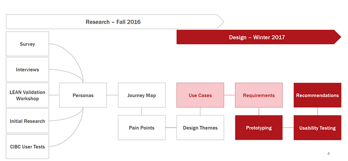
The whole project was divided into the major stages, one is Research stage, the other is Design and usability testing stage.
In the research stage, we firstly used research methods like questionnaires, semi-structured interviews, and literature review combined with leads validation workshop led and user tests carried by the CIBC. All the data collected from the researches led to our persona and journey map. After identifying the pain points during the user journey map, we generated design themes and user cases.
With the use cases, we entered the design stage to engineer the requirements, and then prototyping with softwares. With several iterations of the prototypes, we organized six usability sessions inside CIBC. The comments and results from the usability workshop contribute to the final recommendations on the app UX design.
Research
Literature Review:
To get up to speed on Foreign Exchange landscape, latest FinTech technologies, and traveller segmentation
Survey:
To understand users and travel financial behaviours, resulted on 107 responses that provided insights on financial behaviours during travel
Interviews:
Semi-structured discussions with 8 users produced deep ethnographic insights regarding technology preferences and financial behaviours during travel
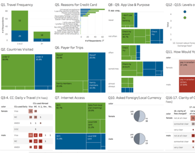
Data Analysis of Survey Results in Tableau

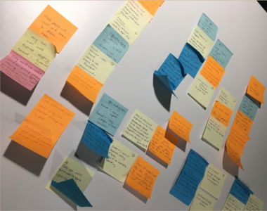
Interview Insights Workshop (Affinity Diagram Method)
Ideation
Personas:
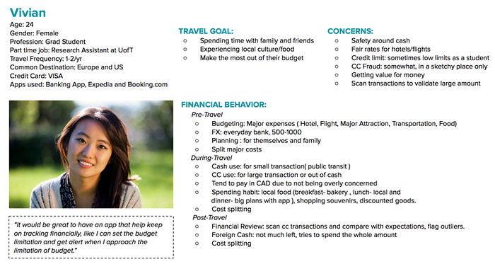
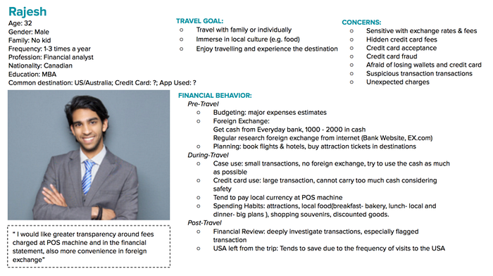
Based on the research data, we generated two personas:
Vivian: Graduate Student, 24, travel for 1–2 times a year
"Would be great for an app to help organize my financials, alert me when close to my budget and help me save money"
Rajesh: Financial analyst, 32, travel for 1–3 times a year
"I'd like greater transparency around the fees I pay when traveling, at the POS and in my bill, to make smarter decisions."
Journey Map:
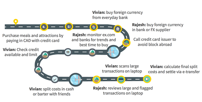
To identify experience pain points and opportunities for Vivian and Rajesh.
Use Cases:
Based on the pain points identified in the journey map and reconciliation with stakeholders at CIBC LIVE Labs, we decided to focus on designing for the following six use cases in the design phase (Solution Stage).

Solution
Low-fidelity Prototypes:
8 iterations
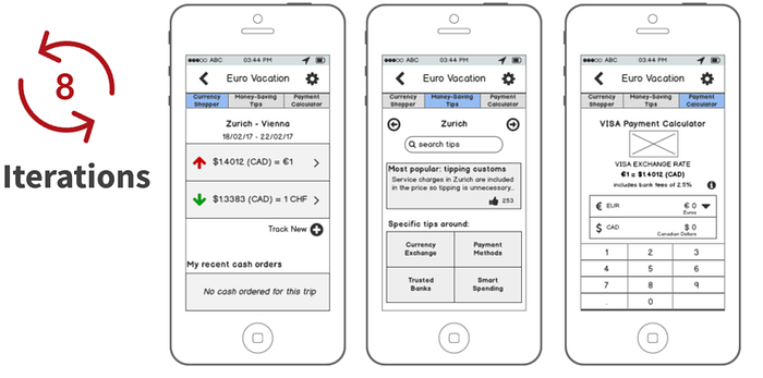
Low-fidelity Prototypes Created in Balsamiq
High-fidelity Prototypes:
More than 10 iterations
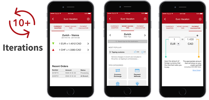
High-fidelity Prototypes Created in Sketch & Linked with InVision
Usability Testing:
- Held at CIBC Digital Usability Lab behind one-way mirror
- Conducted by a facilitator plus note takers
- Captured screen, video, audio, and notes
- Tested with 5 CIBC internal participants
- Walked through 15 scenarios
- Created 30+ recommendations: mainly to increase the transparency of the data, and affordance of designs.
- Lessons Learned: Sweat the data details, Remain completely neutral during facilitation, Make sure participants have a way to communicate across the mirror, Inform participants of the scope of the prototype at the start of test
Summary
After going through the entire design cycle, the team confirmed that the major functions and vision of the app was found to be useful and helpful by users. The focus on user research and the Lean UX approach served to solve most of the big open questions that inevitably arose throughout the process. With that piece of the puzzle in place, and as revealed by the usability tests that were conducted, the focus going forward with future design sprints should revolve around validating the app's information architecture to ensure users can easily find what they are looking for in a very intuitive fashion.
The work files, presentations, and other materials will be made available for the client so they can proceed with implementation which, it is encouraging to hear, we understand is already in the bank's implementation roadmap. Throughout the project the team made an effort to integrate into CIBC LiveLab's workflow, for example by translating requirements into user stories, and we are confident this will in turn translate into a transition with a high degree of continuity as the team moves towards the next iterations.
Updates on the Projects
- CIBC Mobile Banking App released a module named "Travel Tools" in July, 2017.
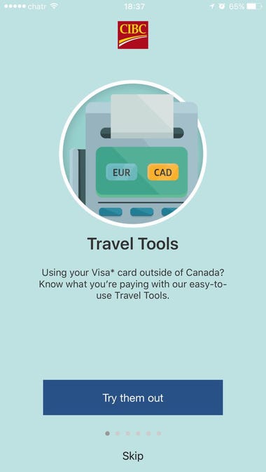
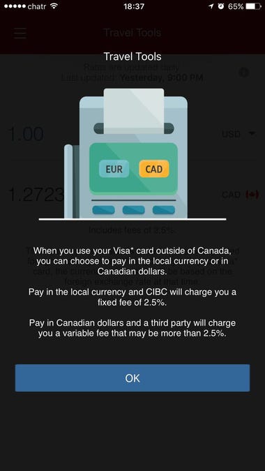
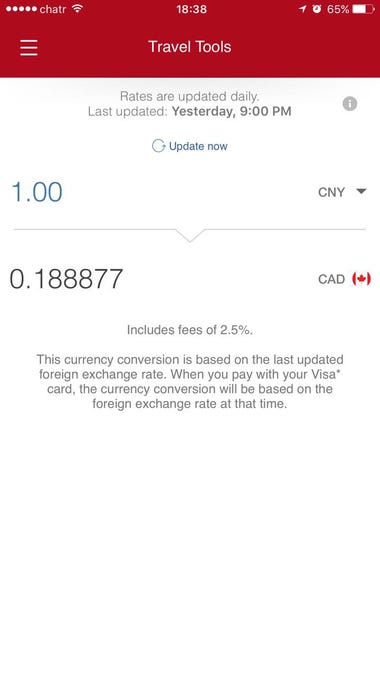
Delivered App Features this June