Participatory Design - Information Architecture of the YourLifeCounts Website
This is a project with the method of participatory design in the half-year course INF2001 Human-centred Design. Our client is a Non-Profitable Organization named YourLifeCount.org aiming to help people with suicide intention and mental health issues.
Team Members
Erin Canning | Ming Fu | Yuchen Jia | Franny Weigensberg | Meghan Willis | Aaron Yin
My Role
User Researcher; User Experience Designer; Documenter
Methods
Participatory Design Workshop; Literature Review; Prototyping
I Learned
Participatory Design; Sketches; Axure; Human-Centred Design

Kickoff
About YLC
Your Life Counts is a small non-profitable and charitable organization involved in suicide prevention, intervention, and postvention, consisting of 8–10 facilitators and, 2–3 advisory board members. The YLC website is an important point of contact. The geographic scope of the website is international. YLC receives emails/messages through the site, and responds to client needs one-on-one. YLC refers to clinicians and 911 as appropriate. There are three main kinds of user groups that access the YLC website: individuals in crisis or with mental health concerns; individuals who have lost a loved one to suicide; and support networks concerned that a loved one may be considering suicide.
Participatory Design
PD is an approach to design attempting to actively involve all stakeholders (e.g. employees, partners, customers, citizens, end users) in the design process in order to help ensure the product designed meets their needs and is usable.
Why use PD? It can produces systems that fit the needs and interests of their users well. And, people have a right to voice themselves in the matters that affect them.
Through a process of investigating, understanding, reflecting upon, establishing, developing, and supporting mutual learning between multiple participants in collective reflection-in-action, we transform our users into co-designers in our two co-design workshops.
Key user definition
- Those in crisis who may be considering suicide
- Attempt Survivors — those who have attempted suicide and survived.
- Survivors of Suicide Loss — those who lost a loved one (or friend) to suicide
- People who are concerned a loved one (or friend) may be considering suicide
And our workshop consists of:
- Users who were one step removed
- Entirely new users
- Ourselves
Key Stakeholders
YOUR LIFE COUNTS: RORY BUTLER
Rory Butler is the Founder and CEO of YLC, and is guiding the new direction. As the leader and our contact point with YLC, Rory communicates the organization's desires to our team.
USER GROUP 1: SUICIDE PREVENTION/INTERVENTION
These are individuals who are experiencing mental health concerns and who may be considering suicide. A very small percentage — estimated 5% — of these users are at a point of crisis when using this service. They may feel resistant or reluctant to engage with the current mental health system for a myriad of reasons, or may be waiting to see a counsellor for the first time and are looking for support during that period.
USER GROUP 2: POSTVENTION SUPPORT
These are individuals who have recently lost a loved one to suicide, and who may be at increased risk for suicide themselves. They may feel resistant or reluctant to engage with the current mental health system because of this loss, and what may be perceived as the system's inability to prevent it.
USER GROUP 3: SUPPORT NETWORKS
These are individuals who have a loved one with mental health concerns and are looking for how they can better understand or support their loved one.
COLLABORATORS & POTENTIAL FUTURE COLLABORATORS
Your Life Counts collaborates with other mental health service organizations. Examples include the University of Guelph/McGill University's Self-Injury Outreach and Support services and the WWE/Creative Coalition anti-bullying program Be A STAR.
Design statement
Our design goal is to design a new clear and consistent navigation system for YLC, with a focus on the new Share Reasons to Live initiative.
The scope of this redesign is limited to the homepage and the website navigation bar or system.
Design Phases
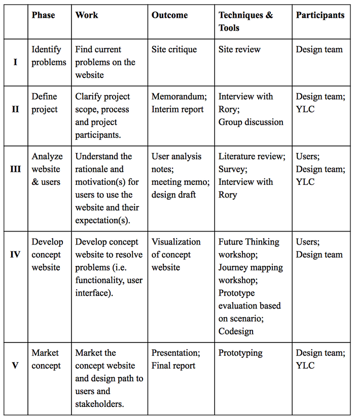
Project Design Phases Table
Research
Website Review
After an initial review of YLC website, we identified three major design issues:
i. INFORMATION OVERLOAD (IRRELEVANT INFORMATION)
The current YLC homepage is very text heavy: there is a large amount of text stacked on the page, and the overall information architecture is messy. Additionally, the information presented feels disjointed: information about YLC upcoming events and fundraising activities are presented alongside the service aspects of the website,, which distracts users' attention from the nature and nuclear sections of this website. We (as users) were overwhelmed by the heavy texts and found it hard to extract useful information quickly. More importantly, users who may be experiencing crisis or suicidal thoughts may experience frustration and anxiety when required to read through an overload of text or unrelated information before finding what they are looking for.
ii. CONFUSING NAVIGATION CLASSIFICATION
The current navigation bar consists of five categories: Need Help, Learning Center, Support YLC, About YLC and News & Updates. Among these categories, there are only two that provide online services (Need Help and Learning Center), which is the essence of YLC, while the other categories focus on organizational information. The current navigation bar fails to efficiently display the core functions of YLC and makes it difficult for users to target what they are looking for.
iii. INCONSISTENT DESIGN AND VAGUE LANGUAGE
During the initial site review, we found that there was a navigation bar layout inconsistency between different sections of the website. As is indicated in the figures below, the navigation bar in Need Help subpages differ greatly from the home page. There are no indexes in these pages that link to other categories, which essentially makes the Need Help section an independent website beyond YLC. This inconsistency may lead to confusion and disorientation. Furthermore, the language used in this unique navigation bar is vague and inconcise.

Home page navigation bar

Need help page navigation bar
Literature Review
Before designing the workshops, we engaged in reading on the topic of participatory design in related projects, which served as the basis for our research activities.
Ellis et al. (2015) and Nicholas et al. (2012) addressed the same user group and focus — young men in Australia who are reluctant to seek help for mental health concerns, with the goal of engaging them — which is very similar to Your Life Counts' target audience and concluded that a fully integrated participatory design method is a successful approach when dealing with this target demographic. The researchers from these projects developed a set of guidelines for other institutions planning to engage in similar projects, which was an invaluable resource in our workshop activity planning (Hagen et al., 2012). Gordon el al. (2016) took an in-depth look at the challenges surrounding a participatory design and concluded that participatory design was an effective way of developing patient-centered, eHealth solutions for high-risk user groups.
Løventoft et. al. (2012) designed and tested an experimental smartphone app to support people with depression. In the design phase, Løventoft et. al. collaborated closely with and collected feedback from mentally vulnerable groups, which were the target users and probably would come up with valuable advice on how to design a highly functional and efficient app. However, due to the confidentiality and security issues, it's difficult for us to get access to and invite the existing users (or target users) of YLC website to participate in our need identification process, which means that we were not able to critique the website from actual users' perspective, therefore the design issues we had identified might lack practical insight.
Besides these academic readings, we also drew on experience from the class, such as the Futures Thinking workshop, to combine our study with real-world practice.
Investigation
Selection of User Groups
As YLC was not able to provide us with users, Terry Constantino and Dr. Susan Sim proposed two solutions for us:
- Access one-step-removed users and support networks
- Work with individuals who had not used this or similar websites to understand the experience of somebody accessing it for the first time.
We ended up reaching out to our social networks to find individuals willing to participate in our PD workshops. However, we were not able to guarantee that participants had experience with websites like YLC, or being a member of a support network for someone who has experience suicidal thoughts. The two workshops were held on March 12 & 19, 2016, in classroom 538 at the University of Toronto iSchool, Bissell Building.
14 individuals participated in two PD workshops, with ten participating in Workshop 1 and eight participating in Workshop 2. There were four new participants in Workshop 2 who had not attended Workshop 1, and so were not familiar with the design process and outcomes of Workshop 1. This may have limited their feedback; however, it did have the benefit of providing us with more participants, so we were able to get a greater variety of ideas and feedback.
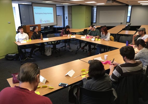
Participants of Workshop 1
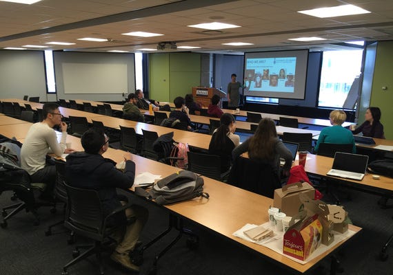
Participants of Workshop 2
Co-design Workshop 1: Concept Development
DEVELOPMENT FROM LITERATURE
Kalbach provided us with suggestions for designing a website navigation by adopting participatory design tactics in his book Designing Web Navigation (2007, p. 184–185). He recommended card sorting as a straightforward and useful research technique focused on learning how users prefer the classifications and groupings of the web content. Terry Constantino also demonstrated the process of the Futures Thinking activity in class (January 27, 2016). For these reasons, we chose to start with the Futures Thinking activity. However, the main disadvantage of Futures Thinking activity is that it focuses solely on content organization and it does not consider users' tasks in context, priorities or information needs (Kalbach, 2007). Therefore, we selected Journey Mapping as our second activity in our first workshop. On the one hand, Journey Mapping is a supplemental tool to put participants in specific contexts, and through the journey steps, we can obtain information about the priorities of user needs; on the other hand, user Journey Maps demonstrate synthesis of how all the research components and stakeholders' strategy (YLC's mission) will come together to meet project goals and user needs (Hagen et al., 2012).
WORKSHOP AND RESULTS
i. BACKGROUND SURVEY
To learn more about our participants, we first asked participants to fill out an anonymous survey with 13 questions to collect demographic information, design background, history of experience with mental illness, strategies for mental illness, rationale and motivations to use the YLC website, and their expectations for the website. We informed participants that they were not obligated to participate in the survey, and were not required to answer any questions they didn't feel comfortable answering. However, most participants still chose to answer all of the questions that applied to them. The results of the survey enabled us to get some great insights that we incorporated into the first prototype. For instance, the top two design features that our participants wanted to see on a suicide prevention website are: a short, simple path to get resources and help, and immediate contact or talk; while the key feature that they don't want to see is things that would add more stress.
ii. FUTURES THINKING (45 MINUTES; 10 PARTICIPANTS)
We spent 45 minutes doing the Future Thinking activity with ten participants in Workshop 1, using a four-step process:
- Gather ideas
- Pair ideas
- Create clusters
- Name category
The workshop began with participants writing ideas about what "thing" (content or functions) they would most like to have on a suicide prevention website on post-it notes individually, and then they joined in pairs to discuss their ideas. Afterwards, we collected the most unusual/original ideas on the whiteboard. We then asked for ideas most different from those on the board. Participants discussed similarities and difference in their post-it notes and paired their ideas. We then asked the participants to think about how the notes related to each other. Ideas similar to those already on the board were added, and sets of similarity started to form. Following the preliminary grouping, they began to name idea sets and refine the groupings. We then transcribed the Futures Thinking workshop results into a spreadsheet to work off of when creating navigation tabs and content areas.
There are six key categories we got from the activity: Basic Information, Tips, Let's Talk, Good Vibes, Personal Stories and Experiences, and Resources. Basic Information includes basic information about mental illness including statistics and scientific research about mental illness. Tips, which is subdivided in two categories: Self and Support Networks, contains conversation tips for individuals and family, strategy and tactics for coping with depression, and steps and advice for risk assessment and safety planning. Let's Talk, is subdivided in three categories:
- message board,
- online peer-to-peer, and
- online with professionals
This includes having a 24-hour phone line and live chat, peer support with an age dynamic, and message boards. Good Vibes provides beautiful pictures of nature and people, and quotes on life and joy of living. Personal Stories & Experiences displays personal statements or interviews with people who have overcome depression, and personal stories written by those who lost someone. Resources connects users to government sponsored solutions, support groups available around the area, and local counseling resources. Participants wanted the language selection buttons, social media buttons, and a Live Chat button to be displayed at the very top of the home page.
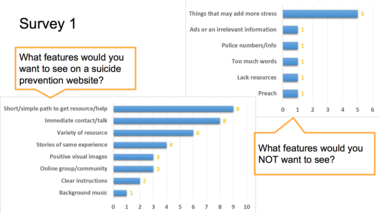
Major Results from the Survey 1
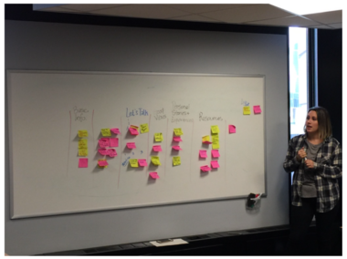
Concept Categorization During the Workshop 1
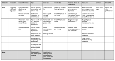
Categorization Sheets
iii. JOURNEY MAP (30 MINUTES; 10 PARTICIPANTS)
The Journey Mapping tool breaks down the thinking, feeling and doing path into 5 steps. Our participants imagined the circumstances that someone in crisis, as well as friends/family, might think and feel, and what they would hopefully do to find a solution.
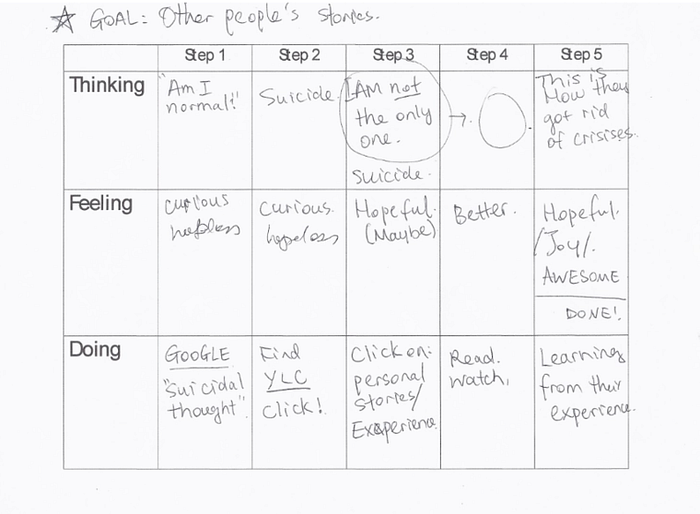
One of the Journey Maps (One filled in the Workshop)
Participants set goals for themselves to map out: they ended up choosing either how to help myself, or how to help my friend; we did not suggest any goals to them. Each pair was asked to journey map a task of 3–5 steps. Participants who worked on the "how to help myself" theme decided to build a path either to (1) read other people's similar stories and experiences with depression, or (2) to talk to someone who can help; participants who worked on "how to help my friend" theme concentrated on looking for (1) information and resources for help, or (2) knowledge and skills of conversation with friends experiencing depression. Based on the outcomes from the journey maps, we were inspired to prioritize these critical paths in our first prototype of the home page and navigation.
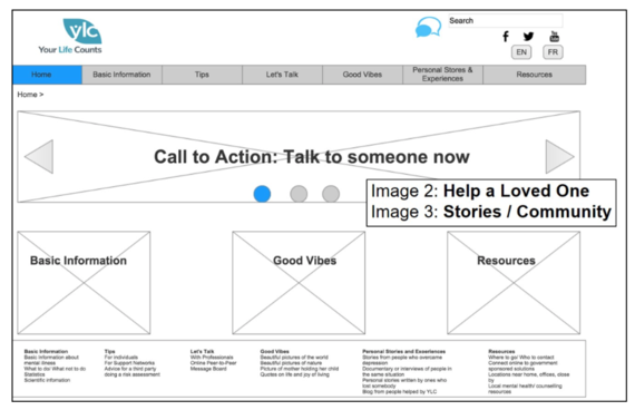
Homepage of the first prototype
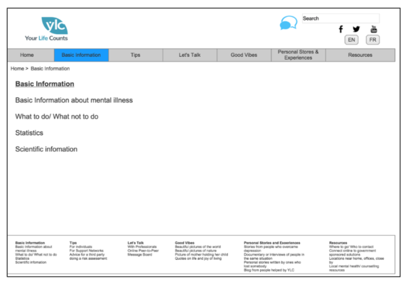
Example interior page of the first prototype
We designed our first draft navigation based on the ideas generated by participants during the activities and discussions in our first PD workshop. There are six sections on the top header: Basic Information, Tips, Let's Talk, Good Vibes, Personal Stories & Experience, and Resources. The Live Chat button, social icon links, and language preference were designed at the right corner of the page which is considered the well-noticed corner by our participants. At the center of the homepage, we highlighted most important content (i.e. Talk to someone now, Good Vibes, Resources) that participant believed were very important for users and should be clearly displayed. In the footer, there are the subsections of the six header sections.
Co-design Workshop 2: Prototype Refinement & Co-design
DEVELOPMENT FROM LITERATURE
Dimmock et al. (2008) illustrated the redesign process of the University of Rochester's Campus Libraries website, which applied the participatory design method together with usability testings develop a more accessible and user-centered website. The methods and activities used in this paper provide us with valuable suggestions on how to delineate the framework of the second workshop. We decided to incorporate a usability testing activity to evaluate the functionality of our first draft of the prototype, and a co-design activity to develop the second prototype to make sure our design is user-centered and efficient.
WORKSHOP AND RESULTS
In the second workshop, we had 8 participants(6 males and 2 females). Four of them had also attended the previous workshop. The age of the participants ranged from 20 to over 40 and some of them had experienced depression or other forms of mental illness. There were two major activities and a concluding survey in this workshop.
i. Prototype Evaluation Based on Scenarios
This activity was aimed at presenting the initial prototype to the participants, providing them with certain scenarios, and collecting feedback on the design of the navigation bar. Participants were encouraged to shout out their ideas at any time during this interactive process.
In order to guide our participants to evaluate our prototype in an organized and structured fashion, we decided to reference some frameworks used in usability testing and created several scenarios that covered the most essential functions of YLC website. Scenarios were created under categories that were generated in the Futures Thinking activity of Workshop 1. When going through each scenario, participants were able to identify and point out weaknesses of our prototype design and propose new suggestions for redesigning the deficient sections.
ii. Homepage Co-Design
In this activity, we joined our participants to redesign the homepage layout. We divided into three groups. Each group produced a hand-drawn layout of the homepage, based on the discussion in the previous activity and their own experiences. All members in a group were expected to fully participate in the discussion to reached agreement on the layout design within 15 minutes and explained their design thinking in detail afterwards.
After each group presented their wireframes, an anonymous voting was conducted to elect the winner of this design competition. Group 1's design won 11 out of 14 votes and was selected as the best design, on which we developed the revised version of the prototype.
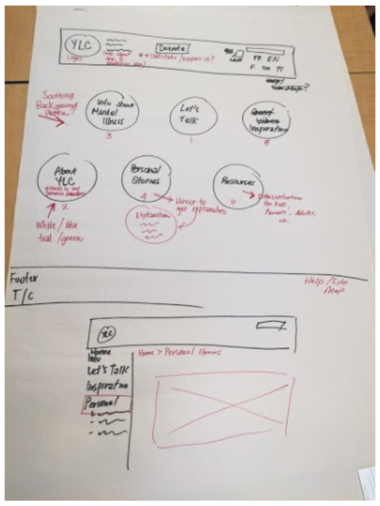
The homepage design document with the highest number of votes (11 out of 14).
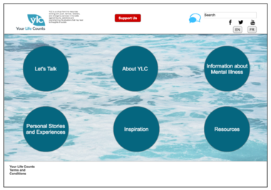
Homepage of the second prototype
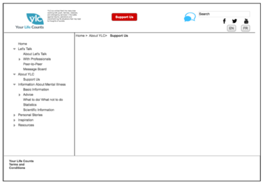
Example interior page of the second prototype
iii. Concluding Survey
After completing the second activity, we invited the participants to fill out a concluding survey to better understand how they felt about this workshop. Like the Background Survey, the survey was anonymous and participants could skip any questions that they felt uncomfortable with or did not want to answer. The survey showed that all the participants enjoyed participating in the workshop and also felt their ideas were valued by others. 6 out 8 participants thought the facilitators did a good job in leading the activities and were satisfied with the final design outcome.
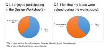
Data Analysis Results from the Concluding Surveys (1)
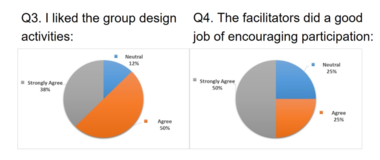
Data Analysis Results from the Concluding Surveys (2)
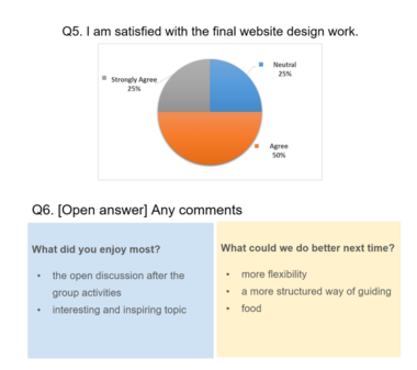
Data Analysis Results from the Concluding Surveys (3)
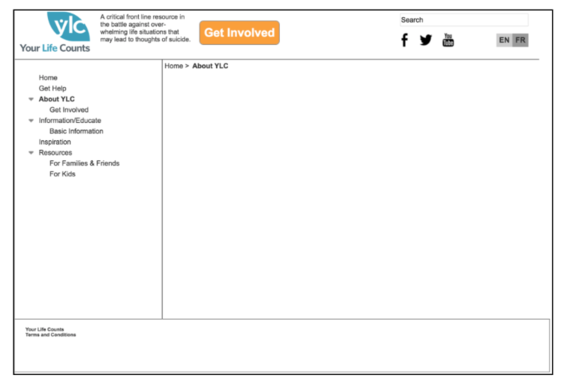
Based on the analysis of both activities in Workshop 2, we were able to further improve our initial prototype. The second prototype highlights the navigation system and removes the banner section we had designed for the first prototype. Participants said that the website should have more calming images, so we placed a picture of calm sea as background and transformed the traditional navigation headers into icons. In order to present the nature and goal of YLC, we put a short organization description next to YLC logo and a Support Us button in the middle. As for the subpages, we kept the left navigation column for quick indexing.
The Prototype 3 was published on the Axure Share
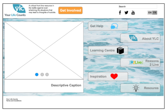
Homepage of the third prototype, which attempts to reconcile YLC's desires with the ideas produced during the workshops.
Example interior page of the third prototype
Reconciliation
Having developed a second prototype after Workshop 2, we compared the concepts drawn from participants with stakeholders' needs, which were sent to us as a concept development and navigation list, to see how we can reconcile the ideas from two sides. The reconciliation proposal, as a part of our project presentation, was addressed to the class and stakeholders from Your Life Counts. After that, we contacted Rory to ask for his team's opinions on the proposed prototypes and reconciliation. Rory sent us comments on our prototype and reaffirmed their needs in details. Based on the collected feedbacks, we further reconciled the needs from both sides in the third round of prototyping.
STAKEHOLDERS' NEEDS
In the concept development and navigation list sent by YLC, the non-profitable organization repositioned itself as an online learning center through which it would steady lives and refer individuals to specialized resources online or in their community. It was dedicated to reconnecting individuals in crisis with their reasons to live and providing guidance and support, online and offline, to families who have lost a loved one to suicide and to those who have attempted suicide. Different from the previous strategic focus on the outreach tool Online Lifeline, the new approach and strategy of YLC intends to change its previously passive situation on their relationship with professional mental health organizations and optimize the management of their existing resources. In alignment with the new mission, Your Life Counts was also advocating an initiative called Share Reasons to Live.
As for the general style of design, Your Life Counts required the new website to be clean and concise with a clear path to help resources, life infusing and inspiring to the extent that users will wish to return and refer others to this resource, and a unique design. Specifically, the stakeholders conceived five concepts on the development of the new website:
- A dynamic signpost that points people in different directions to relevant help and resources was put forward.
- A way of ensuring the site of ShareReasons2Live available to visitors to the new website in order to engage and inspire them.
- The Online Lifeline, which is now accessed as a secondary resource for people who are having difficulty finding help in the health system, needs to be an online intake form to collect individuals' personal information with certain protocols to make an appointment with professionals or volunteers by utilizing a chat platform.
- The previous website contained few pictures, thus, they would like to make good use of images and also have video feeds running through the site.
- An instructional video to assist visitors' navigation on the new website must be prominently displayed on the homepage.
Furthermore, the stakeholders proposed a reference information architecture of the new website in the notes. The navigation list covered 8 categories including Get Help, About, Educate, Training/Consultancy, Programs, Advocacy, Research, and Get Involved. Apart from changing the Online Lifeline to a secondary resource under the Get Help section, the navigation moved resources originally under the Learning Center section like training, programs, and research, to the homepage, which was consistent with their strategic change to a learning center for people concerned with suicide. However, in terms of simplicity, the navigation list was not that concise with 8 categories.
RECONCILIATION OF CONCEPTS FROM STAKEHOLDERS AND PARTICIPANTS
According to the concepts developed from Workshop 2, our second prototype on the homepage of Your Life Counts website was a dashboard with six bubble-shape navigation tab, along with a Support Us feature in the header area.
While comparing the concepts and information architecture of the prototype with YLC's needs, we found there were four groups of overlapped concepts:
- Let's Talk and Get Help
- About YLC and About
- Information about Mental Illness and Educate
- Support Us and Get Involved
These four groups of concepts can be reconciled effectively with rephrasing. Furthermore, the concept Resources from participants could include Training/Consultancy, Program, Advocacy, and Research that are from YLC. Also, as we adopted the original dashboard style in our second prototype that provides a clear path to get resources. This satisfied YLC's need for a clean and unique design style. Apart from that, participants also put forward two concepts of navigation tabs: Inspiration, containing inspiring and beautiful pictures of the nature and families; and Personal Stories and Experiences, containing stories from people with similar experiences. These two concepts coincided with stakeholders' request for a life infusing design style, and their needs for more images as well as the availability of video feeds from Share Reasons to Live initiative.
However, there were several needs and concepts that were not fully explored and reconciled after the second workshop and prototypes. Due to the fact that we emphasized the redesign of the navigation and the homepage, YLC's concept to categorize visitors by a signpost was not accomplished in our prototypes, although we did hear ideas to categorize the section Information about Mental Illness for youth, adults in crisis, and family or friends who want to help. That suggested the signpost idea was wanted by both sides. Owing to the design scope of our two workshops, the specific interaction mechanism of the intake form for visitors to make appointments with professionals or volunteers was not explored in our second prototype. Lastly, the idea of an instructional video on how to navigate the new website was not proposed by participants, and so was not considered in this phase.
After the client presentation, in the further commentary sent by Rory, YLC reaffirmed their needs and provided suggestions. There were five aspects that stakeholders pointed out that we can further work on. First and foremost, they suggested rephrasing the terms Let's Talk, "mental illness", and Tips. Let's Talk is a term popularized by Bell, thus shall be rephrased in another way based on Your Life Counts' shift in emphasis to provide 24 crisis lines and other resources; the terms "mental illness" and Tips sound uncaring and can be lost on people experiencing thoughts of suicide as they were already overwhelmed. Furthermore, the needs for Tips would vary among different sorts of visitors, thus the idea to categorize the visitors at least under the section of Information About Mental Illness section in the second prototype was restated. Thirdly, they also noted that a specific design of intake form and referral protocols under the Get Help was missing. Finally, a specific way of incorporating Share Reason to Live to the homepage of the new website needed to be worked through. Apart from the suggestions, the stakeholders commented that the dashboard style would work well on mobile devices.
Based on the feedbacks collected from YLC as well as the participants from the workshop, we developed our third prototype. To further reconcile with Rory's comments, there were two major changes in the third round of prototyping from the second prototype:
- In accordance with Rory's first suggestion, and after a re-examination of the language used on the current YLC website, we rephrased the navigation tabs Let's Talk to Get Help, Information about Mental Illness to Learning Centre, and Support Us to Get Involved.
- We spaced out a video frame on the homepage to incorporate instructional videos of assisting navigation and videos from Share Reasons to Live.
The signpost and intake form areas remain to be explored in the future.
CONSIDERATIONS FOR FURTHER DEVELOPMENT
For the future development possibilities, we now have to chance to continue to collaborate with Three Point Turn (3PT), the development team of Your Life Counts' new website. Thus, there will be a second presentation to show YLC and 3PT a further refined Axure prototype.
We also have several considerations for further development. Firstly, in order to establish a clear and short path to get resources, we still suggest dashboard as a proper design solution to the homepage layout, and visitors can be categorized by an introductory signpost before accessing the homepage. Secondly, the words used on the navigation tabs can be rephrased in a more user-centred way. Thirdly, it is suggested that the development and design team could collect both quantitative and qualitative data from users to inform further design, specifically, using web analytics and usability testing. Finally, since Your Life Counts' concepts of signpost and intake form are not fully explored in our workshops, they can be the focus of a future project.
Reflections
Major Results Achieved
Overall, after two workshops and three rounds of prototyping, we achieved the aim to redesign the navigation tabs and the homepage based on user-generated concepts and reconciliation between participants and Your Life Counts. The prototypes conformed to stakeholders' request for a clear, life-infusing and distinct design style, meanwhile we respected our participants' idea of the dashboard design of the homepage.
Lessons Learned
For the lessons learned from this participatory design project, first of all, we think it would be better to recruit current users of Your Life Counts if possible. However, in that case, more ethical considerations should be taken into account. Secondly, we do realize that participants can provide useful feedback and diverse perspectives to make a website better. Thirdly, we should keep in mind to encourage participants' engagement. In our two workshops, by organizing small groups of discussion, we made sure that everyone was more likely to be heard and participate in the co-design workshop. However, when an overly talkative or assertive participant hinders others' expression, facilitators could also politely lead the conversation back on track so that others may have the space to express themselves.
Reflections on Participatory Design
Despite the fact that we had to adapt our user base to assist us in the participatory design process at the last minute, we were excited about the opportunity to try something new. In fact, the results of our anonymous intake survey showed that 6 out of 14 of our users have personally helped or knew someone experiencing mental illness at some point in their lives, demonstrating that they were a good user base for this project. Our site review and our interim report, in addition to our meetings with Rory and YLC, helped us to create workshops and activities to facilitate with our participants. This helped us generate ideas we may not have come up with on our own. Due to the sensitive issues and user base, we knew that participatory design was essential to redesigning the navigation (and some of the home page) because web designers, coders and developers do not necessarily represent or embody the intended users and, therefore, may not be able to as effectively create a user-friendly and informative navigation for YLC.
We found it extremely interesting that the ideas generated by the users and by YLC were so similar: even when the wording was different, the ideas embodied shared many core similarities. This helped in our reconciliation process, as we felt that we were able to stay true to the desires of our participants while incorporating the aspects desired by YLC. The co-design activity was particularly informative for generating new ideas about how to achieve design goals laid out by YLC. We felt that the workshops provided us with insights and understanding that we would not have gotten had we worked directly with YLC alone.