Redesign the UI of Figure 1 iPhone App for Medical Knowledge Sharing
Methods:
User research, Informal user interview, Interface design, Requirement engineering
I Learned More about:
User Growth, User Community Operation, iOS Application Interface
The Figure 1 Redesign project was based on 26 user requirements from the pain points I collected as a Figure 1 Student Ambassador.
Figure 1, is a medical knowledge-sharing application for global healthcare professionals to view and discuss medical cases, and network. There are available free mobile apps on iPhone, iPad, Android, and Web platforms.
Due to the convenience, I chose the Figure 1 iPhone app to start the redesign. There are 5 tabs of Figure 1 iPhone version 8.24.0 (as of October 4th, 2017). I will start from the redesign of Home tab. Below is the current Home Tab.
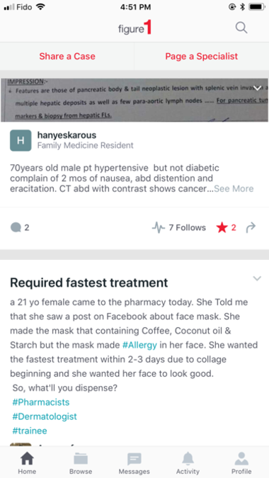
Current Home Tab v8.24.0
Eliminate the "Favorite" icon
The first major Redesign subject is the "follow" icon and texts and the "favorite" icon, which is purportedly confusing by some users.
In order to clarify this confusion with interface design, I decided to leverage the "bookmark" icon in order to replace the favorite icon.
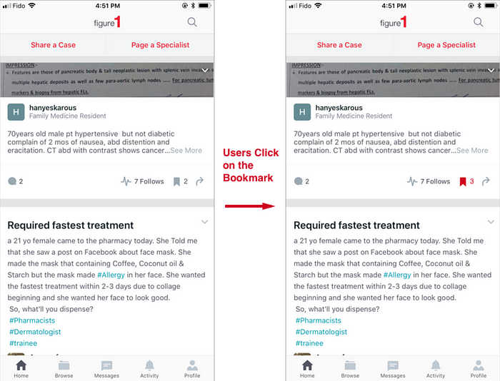
Redesigned Home Page Tab with the Bookmark icon
Besides, when users long-press on the "Bookmark" icon, a small pop-up will also be displayed upon the cases, prompting the users whether to save to his or her collections or not.
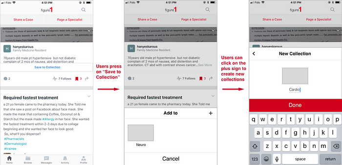
Users can long-press the bookmark icon to add to their collections
The introduction of bookmark icon and elimination of favorite icon will change the interface design of the profile Tab.
Redesign of the Profile Tab after introducing the bookmark icon
The current profile tab screen is below. Besides the identity, interests, and bio information of the user, the lower section of Profile Tab contains 5 sections, namely "invite colleagues", cases, comments, followers, collections.
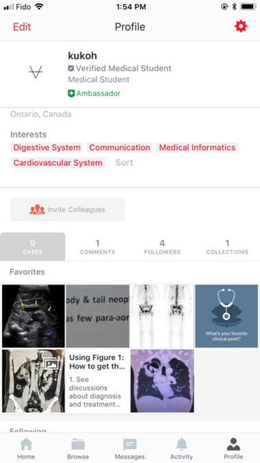
Profile Tab v.8.24.0
However, there are a few information redundancy and dislocation at the lower section of the screen.
A. Invite Colleague button should not be categorized with the other four sections. I personally think it should fall under the upper section of the screen with the bio identity and username.
B. The cases section contains favorites and following cases. Both of the subsections of the cases section didn't contain much users' data input. I believe, the space on the interface should maximize users' participation and trigger users' interaction, instead of just displaying the history and letting users browse.
The following cases features should fall under the activity tab, where users can easily see the updates of new cases. While the favorite feature has been taken out, we don't need to include the favorited cases any more. Thus, the cases section could be eliminated. Instead the cases should only include the cases uploaded by the user.
C. The followers subsection contain both followers and following users, which is not logical for users to navigate. Instead of explaining the section with texts, we can simply use icons like connections or a name card icon. And its attributes fit more into the identify or personal information section, which locates at the upper section of the screen.
D. As I substituted the favorites with bookmarked, all the bookmarked cases will fall under the Collections subsection.
As for the upper section of the screen, the badge and verified identity be simplified, like "medical student" doesn't need to be displayed now that there's a "verified medical student" badge.
Thus, the redesign of the profile screen would look like this.
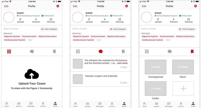
Redesigned Profile Tabs
Due to my redesign approach, updates on users' following cases will be removed to the "Activity Tab", thus the next redesign task would be on the activity tab.
Relocate Updates of Following Cases to Activity Tabs
Currently, the activity tab of Figure 1 iPhone App is mainly organized chronologically. The notifications of new followers, cases updates, or updates of users, are mixed in one cascade feeds, which is not that easy for users immediately identify certain activities or updates.
Thus, I decided to categorize the activity tab into three major categories, namely; new cases, case tracking, liked & followed. The cases that the followed users posted will also go to the home feeds, which will show up preferentially besides other cases under the specialities followed.
The current activity tab looks like below.
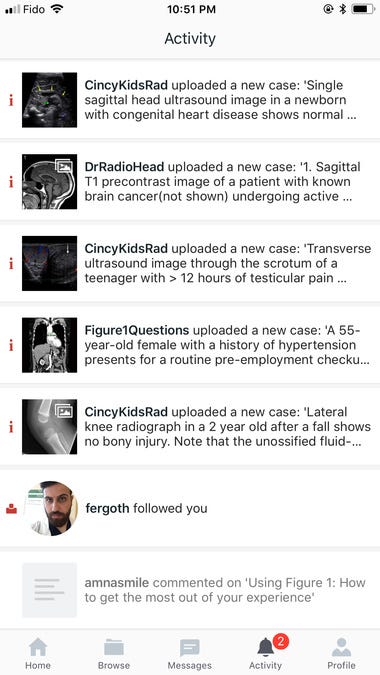
Current Activity Tab v8.24.0
After the categorization redesign, it will look like this.
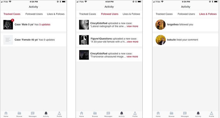
Redesigned Activity Tab
On this redesigned Activity Tab, users are able to view the activities especially the cases and users he/she follows on the clear and simple manner, instead of getting a whole screen of mixed activities.
Upon switching between the three categories, users can be enabled to swipe between the interfaces, which is a more intuitive interaction for users.
Browse Tab Texts Rephrasing
The "1319 cases paging a specialist" tends to read like "1319 cases", without reading the subtitle. That makes users think there are 1319 cases on Figure 1. I recommend rephrasing it like "1319 Paging Cases", which is much more simple and understandable.
Besides, the search input texts' color could be set darker like below right.
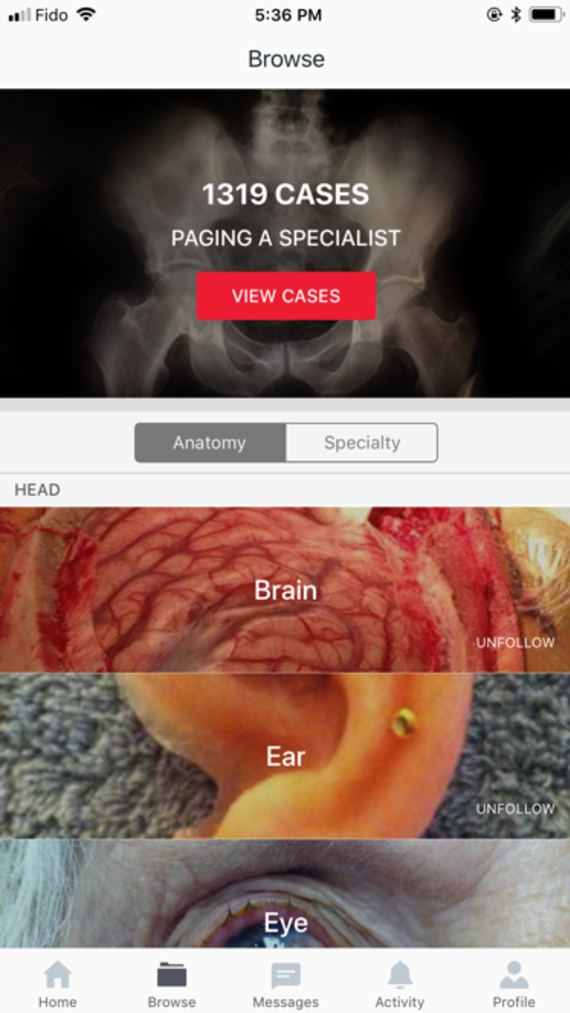
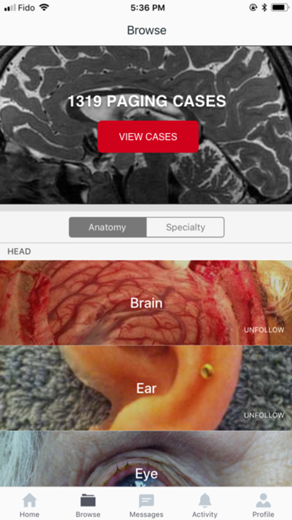
Text Redesign for Browse Tab Header
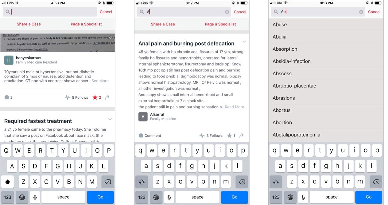
Texts Redesign for Search Screen under Home Tab