UI Design of Meducal, An App for Knowledge Sharing on Medical Cases
Duration: Sept. 2017 — Present
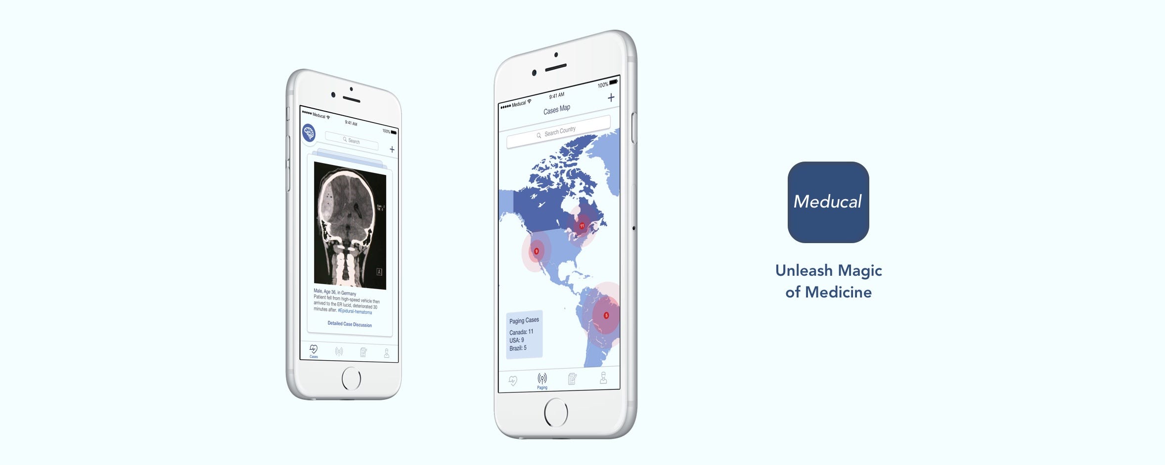
My roles
UX designer; Interaction Design; Information Design; Interface Design; Prototyping; Mockup
Methods
Requirement Engineering, User Flow Diagram, Sketches, Low-fidelity Prototyping, High-fidelity Prototyping (Sketch); Interaction Design (Marvel)
I Learned
iOS Interface Design Guidelines, UX Design Process, Design Scope, Medical Education (MedEd) and Healthcare IT Industry
With the purpose of sharing free and open medical knowledge within medicine lovers and healthcare professionals/students, I kickstarted an UX design project of a mobile application called Meducal. Yeah! a MedEd app envisioned to augment users' medical knowledge and healing power.
I decided to present this project as a case study to go over the design process I followed and explain my thoughts behind each design decisions I made.
My Design Philosophy
In the information era, loads of information lacking organization are not valuable any more, instead it's inclined to cause information overload, cognitive burden and scare users away.
Imagine in 10 years when technologies are more mature than now, what actually matters won't be the information, instead it might be how to organize the relevant information while solving a problem in a real-world scenario, especially for students or professionals in the healthcare industry.
The Three Questions
In order to provide guidance for the whole project, I need to answer the following 3 questions and define specific goals.
- What is the problem that we are trying to solve with Meducal?
- Who is the target user? Why would he/she use the app?
- When would they use the Meducal app?
For the first question, I wanted to understand why somebody would want to use medical apps. After reading articles and interview medical students and professionals. I found people want to:
- Learn free and up-to-date medical knowledge
- View real-life cases and safe lives
- Practice clinical skills for work
The potential user group can be premed/medical students and healthcare professionals. They would use this app because of it's secure (HIPPA compliant), social, and medical-related.
I hypothesized that the target users for Meducal would be medical students and healthcare professionals who need to refresh, share, and apply their medical knowledge on clinical scenarios to heal patients in the future.
As these users can be quite busy in their daily working and studying life, they would use it once a day, or when they feel the need to.
Research
I researched on some popular MedEd mobile apps already on the market. Most of them are affiliated with educational tutoring companies, like BrainScape, MCAT Prep from Varsity Tutors, Flashback from OnlineMedEd. These apps are not enough for becoming a sustainable and and open medical educational platform.

A Medical Cases Sharing App
Meanwhile, some open medical platforms like Figure 1, whose target users are also medical professionals/students, lack clear organization of information and the navigation can be clunky. I did semi-structured interviews with Figure 1 new users on the challenges of using the app and generated 26 requirement shells from the collected pain points.
And the common problems of these medical apps is information overload, endless learning decks or medical cases in their feeds. Nowadays, the simple feeds comprised of "Following" are not enough for cheering up users. Instead, a new feed module should be invented.
Due to the fact that medicine is an information-intensive discipline, medical Apps like Figure 1 definitely need an information re-architecture. Also, more incentives for less-experience medical (healthcare) students should be added to the app. If not, this user group tend to be a bit silent and can lose interest of opening your app soon.
Solving the Problem
Keeping this all in my mind, I set three goals that I would like to achieve with this Meducal project:
- Help healthcare professionals navigate easily on the shared medical cases resource banks;
- Provide features that are supportive and friendly for medical students and students who are interested in medicine;
- Keep the overall interfaces as simple as possible since I am targeting busy and heavily-burdened healthcare professionals who won't bother wasting time navigating.
Features & User Flows
After the research and preparation, I had an ideal envision of the top 3 features that I would like to design.
- All users can share medical cases and clinical knowledge from a patient (case) template as a start point.
- All users can use an innovative but easy-to-learn model view to navigate and browse shared and paging medical cases.
- Medical/health science students can test their clinical and medical knowledge skills using a gamified quiz section.
I started by drawing the user flow diagram of Meducal.

User Flow Diagram V.1 (Rectangle: Screen. Diamond: User Decision)
At the 1st version of User Flow Diagram, I considered leveraging a human anatomy model screen to map all the cases, but I found it wouldn't be convenient for users to navigate around a body model in and out, as the nosogenesis can be anywhere inside or on the surface the body, which demands a really sophisticated 3D human model.
Then, I reflected on why I ideated a body view at the beginning. It is because I intended to achieve the goal of leveraging a model with less cognitive burden to map out all the cases for easier access. The idea "map" inspired a second attempt.
A case generally contain explicit information of the patient (gender, age) and symptoms (in text or image). However, the implicit information of the patient or case poster usually needs to be induced by discussing and messaging back and forth, such as the location info. And actually, the location information can be quite important for a telemedicine application as well.
Thus, in the 2nd version of user flow diagram, instead of using a body model, I decided to leverage a map model with simpler case templates (displaying gender traits) for users to access.

User Flow Diagram V.2 (Rectangle: Screen. Diamond: User Decision)
At this 2nd diagram, the basic structure and user flows of the app were almost settled. I decided to design three tabs, namely Cases, Quiz, and Profile. For the Cases tab, user are able to switch between a feeds view and map view of cases in order to choose their preferred navigation interaction style. Then, I marched on into the Sketching using this 2nd version user flow diagram.
Sketching
Due to my own daily mobile usage preference, I decided to choose the iOS as my design platform. Thus, I leveraged the three-tab bar to help users easily navigate between features. My sketches were organized by the 6 screen blocks, namely Sign up, Sign in, Cases Feeds, Cases Map, Quizzes, Profile.

Sketching V.2
In order to present the sketches in an interactive way, I also made an interactive low-fidelity prototype inside the iPhone 6 Plus Mockup using Marvel's Pop.
Wireframing
After iterating for severals times on the sketching, I moved on to design wireframes in Sketch. I firstly determined the color palette: as my target user groups are medical professionals, I decided to use the color of scrubs, mainly blue different shades. For those areas that need attention, I used the red.
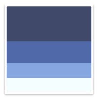
Meducal's Color Palette
Aiming for cleaner layout and more detailed interaction design in the phase, I decided to change some work flow illustrated on the Sketching.
- Due to the initial idea of cases feed view and map view under one tab could be quite clunky, the map view was transformed into a new tab for user's navigation, which led to a four-tab navigation bar.
- For easing user's navigation between cases of different chosen specialties or interests, I decided to leverage the Duolingo language switching interface on the Cases feed for easier switching interaction between specialties, which is to use a top-left button as a switching section.

Wireframe V1.0
Welcome Screen
On the welcome screen, I wanted to make the interface conversational, thus used a conversational tone with the slogan of Meducal "Unleash Magic of Medical Education" to hail the users.
Sign up/Sign in
For the first time user flow, to reduce friction, I asked for user's name, email address and password at the first screen, then I asked them to choose their interests or specialties (no more than 6, for cognitive burden reduction). After that, users can tap on the map to choose their country if desired. The information logged at this flow will be used to generate further case feeds and paging map details.
After all information set up, users will be told his/her user ID from a his/her own country, which I consider would bring a stronger sense of community to a new Meducal user.
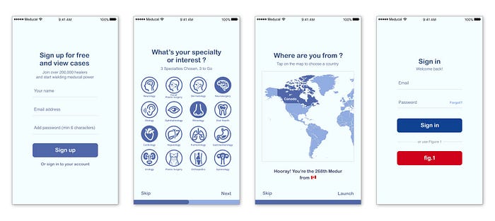
On the Sign in screen, users can sign in to their Meducal account or Figure 1 account. This is aimed for users who already have accumulated digital medical resources capitals.
Cases Feeds View
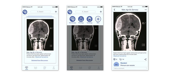
I decided to abandon the generic cascade view which are endless, obsolete, and not metaphorical, and leveraged a Cards View (I would call it Meducal Case Sheets here) in order to match a medical case mental model for healthcare professionals and students.
The basic information of a case like gender, age, location, symptoms will be displayed on the case sheet. Users are able to flip between cases, double tap if they would like to know more about a certain case, then the case sheet will lead users to a case details screen, where the whole discussion on the case will be going on.
Meanwhile, for more user control and fluent users' navigation, on the cases cards view, users are able to switch between different specialties (as said earlier), like from Neurosurgery to Cardiology by simply tapping on the top-left corner. They can also edit their specialties by tapping the "add" icon.
Cases Map View
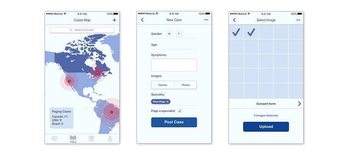
I designed the map view to give users a clear view of the paging cases on a global scale. I also added a legend to the map view in case the pins are too small for some users. By tapping on the pins, users would be led to a cases cards screen from this country to see more paging cases to help.
Also, users can search for a certain country that they are interested to browse and share more information the local paging cases. This enables the community to connect on a transcontinental scale.
If users want to upload a new case, simply tapping on the "add" icon on the top-right corner (available both on the cases and paging screens), they will be able to edit a new case and upload case images (and consent form) if needed. On designing the case sheet, I decided to list gender and age as specific fields since these are important demographic data of cases, also users are able to input the information in a more unified way, which will enhance the readability of a certain case.
At last, the "paging a specialist" will be an option for users to check. If checked, the cases will be shown on the paging cases map tab as well.
Quizzes
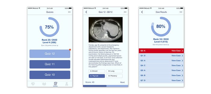
For enhancing users' engagement and retention of the quizzes section, I added gamification elements like scores, rank, and level, which will possibly incent users to focus more while taking quizzes compared to a screen without those elements.
For bringing more diversified cases to users' attention, each question in the quiz will be linked to a specific case on Meducal. After each quiz, the wrong answers will be color-coded in red and pinned on top of the quiz explanation, and for further review, users can tap on the bar button to view more detailed discussion on the case.
Profile
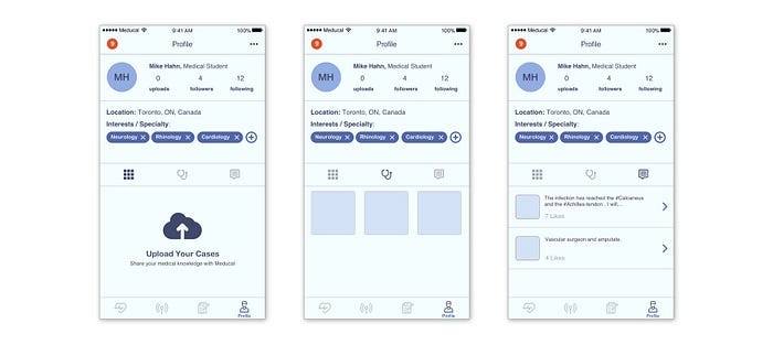
The profile will display user's information like identity, connections, interests and Meducal community data. The uploaded cases, following cases, and comments will be featured below the basic information section. The bottom section was intended to encourage users to participate more on the cases discussion and sharing, and meanwhile provide easier access to their following cases or previous activities if needed.
Also, I decided to leave the upper left corner of the profile screen as a message notification icons, which will lead users to a message screen. The message feature is not among the top features that I defined from the beginning, thus I minimalized the design and didn't want it to distract users from other main screens much.
Hi-fi Mockup & Prototypes
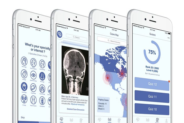
I used Marvel to connect the hi-fidelity wireframes to be interactive prototypes. Feel free to check them out and tap around below. And please give me a shout if you find anything interesting, for which I will really appreciate it. This is only the first version (v1.5), I will keep on iterating the interfaces.
Hi-fidelity Prototypes Linked in Marvel
Uncovered Possibilities
I didn't cover every detailed screen of Meducal. For the next step, I will consider polishing more details on features like:
- Cases language translation under cases feed, as cases from a different country may be written in a totally different language. Only after translation, will those case information be communicated successfully.
- Diseases hashtags under cases details. For medical freshman students, a certain disease hashtag on a case would seem umfamiliar. Levaraging the hashtag, I intended to include a basic wikipedia introduction on a certain disease hashtag screen, which may help medical student learn new medical terms immersed in a real-life scenario.
- Medical abbreviation search, users will be able to search for obscure medical abbreviations under the quizzes tab, as medical professionals prefer to user jargons while describing cases symptoms.
Last but not the least, if you're interested in Meducal, come and pre-register on our Medium publication page. Thanks for your reading!
More on Meducal:
Augmented MedEd: 3 Iterations of Meducal iOS app v1.0
